
Flavors of Authenticity
In a Gen-AI world, it’s increasingly important to make some distinctions
Anything made by graphic means is a picture, and if it is made with a camera it is a photograph. Distinctions finer than this are required by relatively few people.
— Minor White
In 1974, when Minor White wrote this, photographic interactions were far simpler than they are today. Now, 50 years later, when we are inundated with images and all of us are picture-takers, finer distinctions are more relevant. First with Photoshop, and now with Gen-AI, we all might enjoy more ways to think about authenticity, and what we expect from our images.
James Gilmore and Joseph Pine, well-known authors and economists, approach the concept of authenticity from a consumer perspective, particularly focusing on the experiences and products they engage with. In their book “Authenticity: What Consumers Really Want” (2007) authenticity is gauged by two primary questions: “Is it true to itself?” and “Is it what it says it is?”
This forms what they called the Real/Fake Matrix — a 4-way grid of “flavors” of authenticity:

What was particularly useful in Gilmore and Pine’s breakdown was their acknowledgment that all retail businesses are constructed and, at a fundamental level, fake. Accepting this premise as given, they then went on to examine how businesses are experienced by their customers:
Is it true to itself? This question explores whether a product, experience, or service maintains its core identity and values, remaining consistent in what it presents itself to be. Is it internally consistent? For instance, a product claiming to be organic must hold true to the standards and practices of organic production without deviating from them at any point.
Is it what it says it is? This aspect focuses on the transparency and honesty of the product or experience in question. It examines if what is being presented aligns with the reality, thus not misleading the consumer in any form. For instance, a brand that claims to use only sustainable practices should be able to substantiate this claim without any contradictions.
I particularly liked this approach because I’d settled on the Edward Weston statement that ALL photography involved a willful distortion of fact, and that sounded very much like Gilmore and Pine’s starting point with businesses. Everything about authenticity has to rest on a platform of the fundamentally fictional nature of the photograph.
Taking Gilmore and Pine’s system in hand, I wondered if it was possible to view photographs through this filter. It’s not easy, although it is an entertaining game and probably a useful thought-exercise. This isn’t dogma: I frequently classify an image, then change my mind. But I’m starting to settle into these:
REAL-REAL
is what it says it is, and is true to itself
The photo accurately represents the scene to the degree possible. It would have “journalistic integrity.” At some level, the photograph only “works” because we know it to have that integrity. These could also be described as “pure seeing,” although that’s only one aspect of its production. It’s largely an aspirational sort of authenticity for photos — because there is always at least some small way it has been post produced to enhance an aspect of the pure seeing. But this is the nature of photography’s fiction in general — the camera simplifies a scene by modulating light.
REAL-REAL is the principled domain of photojournalism.
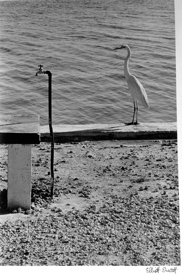

These photos only have delight to the degree the viewer appreciates the scene was noticed and captured. To go into Photoshop and create them would be relatively underwhelming. At left Elliott Erwitt, “Florida” (1968); At right Sebastaio Salgado “Greater Buran Oil Field, Kuwait” (1991). © Magnum
Another sort of REAL-REAL is this, not a simulation of a tintype, but an actual tintype, combined with an actual image not trying to be something it’s not, and presenting a candid (mostly) scene.

Wet Plate Collodion Process — Tintype photograph by Borut Peterlin from the workshop of Uglješa Dapćević and Mišo Keskenović at Academy of Fine Arts Novi Sad in Serbia. From https://borutpeterlin.wordpress.com/2011/11/26/wet-plate-collodion-workshop-results/ ©2011 Borut Peterlin
FAKE-REAL
is not what it says it is, but is true to itself
A Uelsmann image presents as surreal and dreamlike — so while you cannot discern how it was constructed, it tacitly reveals that it was constructed. The digital montages of Maggie Taylor similarly are also fantastical and unreal scenes, and present as such. They’re not real, but they make that clear.
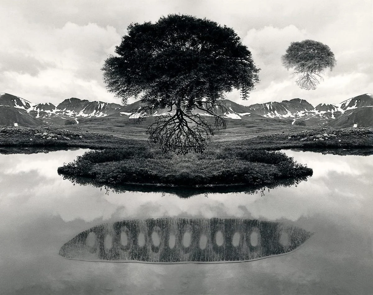
Jerry Uelsmann, “Untitled/Floating Tree (1967) — a photomontage silver print. Maggie Taylor (2023) — a digital montage. © 1967 Uelsmann Estate and © 2023 Maggie Taylor
Also in this category is the staged or constructed shot that presents as such, without trying to be something else. Studio shots frequently provide this sort of transparency. They’re also un-natural, and maintain integrity as what they are.

Irving Penn, “Frozen Foods” (1952) — a real shot, a real scene, and obviously set up for the camera. Conceptual, but not trying to be something it isn’t. © 1952 Irving Penn Foundation
Also an alternative process that appears an alternative process — like a Rayograph, and obviously executed by a creator:

Man Ray (Emmanuel Radnitzky) “Untitled (plate 2)” from the album Champs Délicieux (1922)
REAL-FAKE
is what it says it is, but is not true to itself
There’s a lot of photography that falls in this quadrant. A doctored photo, retouched to change what it presents — it looks like a pure scene photograph, but the scene did not happen as shown. Stalin removing a dissident from an image.

This classic manipulated image of Stalin is clearly propaganda, designed for political goals.
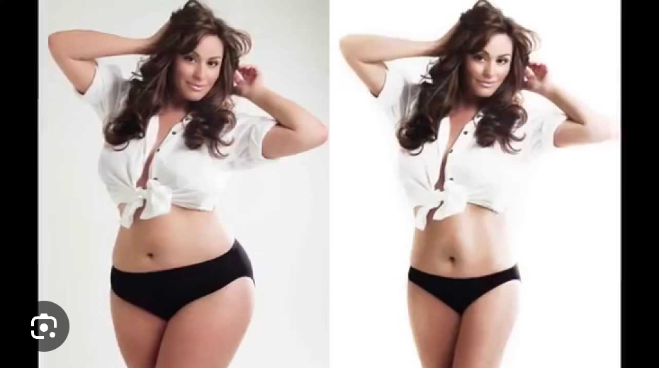
Similarly, the issue of modifying bodies in Photoshop, while unethical and rich with social issues, can be clearly seen as inauthentic, designed to change the subject for commercial reasons.
It could also be staged in some way, orchestrated so it seems candid, but is in fact constructed. The staging can be in the production, as in the Doisneau below, or it can be in post production, as in the sandwiched negatives from Steichen.
The issue isn’t that a photo is set-up, it’s only that it doesn’t appear to be. Unlike Uelsmann, they don’t present as the construction they are. This falseness can be used negatively, to deceive (like Stalin), or positively, to entertain/inspire (Doisneau).

Robert Doisneau, “Le Baiser de l’Hôtel de Ville” (1950) — one of the most iconic images of the 20th century was later found out to be staged. At right, Steichen’s portrait of Rodan (1902) was two images put together.

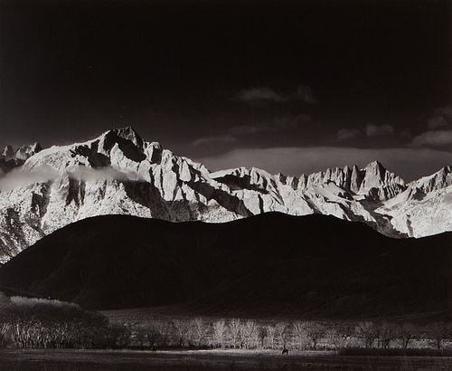
Perhaps an important case is the work of Ansel Adams, who did prodigious darkroom work to make his photographs of nature be more dramatic and inspire affection for the wilds. But he had no qualms about making the photo the way he WANTED it to be. It’s a common statement from photographers that their images are what they felt, what they experienced, and not simply what they saw.

Ansel Adams, “Winter Sunrise, Lone Pine” (1947) — the image at left was what he shot; at right, after exposure and editing, the final print. Adams rationalized it this way: “The enterprising youth of the Lone Pine High School had climbed the rocky slopes of the Alabama Hills and whitewashed a huge white L P for the world to see. It is a hideous and insulting scar on one of the great vistas of our land, and shows in every photograph made of the area. I ruthlessly removed what I could of the L P from the negative (in the left-hand hill), and have always spotted out any remaining trace in the print. I have been criticized by some for doing this, but I am not enough of a purist to perpetuate the scar and thereby destroy — for me, at least — the extraordinary beauty and perfection of the scene.” It’s a positive feeling removing the LP, but perhaps a negative feeling if he had added the horse. © 1947 Ansel Adams Publishing Rights Trust

Educational materials explain how to make a snapshot present as old film. Above from https://webdesign.tutsplus.com/recreating-instagrams-retro-filter-effects--webdesign-10440a
FAKE-FAKE
is not what it says it is, and is not true to itself

Jen Thompson (2013) from http://www.festiveattyre.com/2013/12/faux-victorian-photos.html
Artists generally don’t have to contend with the authenticity of what they create. Because paintings and graphics fundamentally present as what they are — a creation — the distinction is moot. Many photos subordinate issues of “authenticity” for classic attributes like beauty and creativity.
Instagram filters can take a regular snapshot and make it seem like it was produced as a tintype or a Polariod. Grain can be added to a digital image to present as if shot on film. Add to this if the scene presented is also constructed, subjects dressed as cowboys in the old west, for example, with an image that appears a Daguerreotype, this produces a compounded falsity. Imagine Hipstamatic, or Instagram 2010.
A photo-realistic painting would fall here — it presents as a photo, but it’s constructed without light (paint), and the scene that seems to be shot is perhaps imaginary. (It also has the added dimension of contrast between what it is and what it appears, something the artist Chuck Close explored.) Worth adding that paintings of any kind shouldn’t be added to this exploration, except to the degree that photo-realistic painting is really quite close to Gen-AI and helps clarify our feelings about that medium.

Chuck Close, “Big Self-Portrait” (1967–68) Acrylic on canvas. © Chuck Close Estate
AI-generated scenes would also land here — they appear to be photographs, but they’re not, and they purport to show something real, but they don’t. But not having this sort of “authenticity” doesn’t preclude it from being honest, providing insight and feeling. They are paintings.
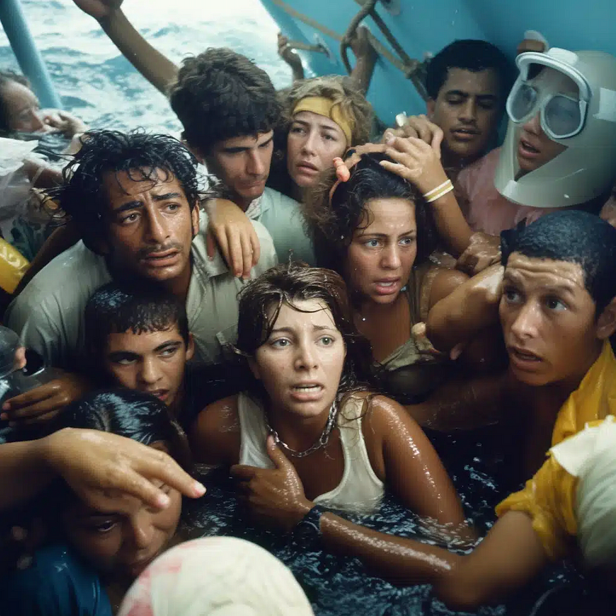
Michael Christopher Brown, from his series “90 Miles” (2023) — not photos, but beautiful images telling a story of the Cuban history, generated with AI. It would be nearly impossible for a viewer to understand these creations without explanation, they present as something they are not.


Cindy Sherman, “Sun Tan” (2003) — conceptual art, particularly when it’s photographic, is always more challenging to quantify as “authentic” or not. If a work is always connected to a banner of understanding as “art” — then issues of authenticity drop away. But when an image is divorced from that understanding, authenticity is harder to discern. © Cindy Sherman
Constraints for Personal Authenticity
Photographers frequently layer in a range of idiosyncratic constraints and personal codes to articulate their authenticity, but it’s impossible for viewers to understand these only by looking at their images. The only way these can be understood is by context and, perhaps, metadata.
Photojournalists would want to capture scenes undirected by them, unmodified, and if possible, utterly candid. This is an ethic that would hopefully give the public a sense of trust.
“Pure” photographers might not demand a level of journalistic non-interaction, but still would insist the scene not be modified in any way, candid, just shot as it presented itself. This may or may not extend from the shoot into the editing.
Photographers generate a host of lines drawn in the sand related to the right degree of image modification they will accept for themselves (or others). Some would demand images not be cropped (like Cartier-Bresson), and others would crop and burn and dodge with impunity. Some who would crop and burn and dodge might draw the line at adding or removing elements using tools like Photoshop, but others might allow “light” retouching, minor removal of elements, but no additions. In terms of this matrix, none of these principled approaches is different except by degree.
Even something as innocuous as removing color from a image is a falsification of the scene. If the intension is to make the photo feel “old timey” it would certainly lean towards inauthentic, making it something it’s not. On the other hand, it also tacitly announces the image is a creative product, not just a scene from the world but one that has been reconceptualized and presented for the viewers’ benefit: it announces ‘this is a photo created with purpose,’ and in that way it’s more authentic than a color photo, which masks its abstract nature by looking very much like a scene we might see with our eyes. We also can’t tell if the image is monochrome as a natural result of shooting b&w film, or from extracting the color from the RAW file, presuming those distinctions matter. Consequently, without more context, it’s hard to say if a monochromatic image presents more or less authenticity.
It’s a fun mental exercise.
The history of photography is a story of steadily increasing democratization; each invention — from the Daguerreotype, to Kodak, to Leica, to the SLR, to Polaroids, to smartphones — lowers the barrier to entry, makes the effort smaller, produces better images. With the advent of computational photography, every image created is augmented, perfected. It’s almost impossible to imagine an unretouched image. The category of REAL-FAKE is the domain of most photography today.
Authentic vs Inauthentic is not the same as Good vs Evil
Unfortunately, it isn’t possible to suggest that authentic is more good than inauthentic, even if it sounds that way. Images can be used to persuade (like advertising) or misinform (propaganda), which can be negative in some cases and positive in others. Jacob Riis or Dorothea Lange’s REAL-FAKE images were used to effect positive cultural change and shed light on hidden social problem. Adams’ work inspired support for our National Parks. Photography is often about persuasion. It doesn’t necessarily make it bad or wrong.
Gilmore and Pine’s framework helps us explore the nuanced spectrum of authenticity in photography. By seeing authenticity as a complex attribute rather than a continuum or even binary state, we can better discuss the creative truths in photography—from journalistic integrity to artistic manipulation and AI-generated images.

What are your thoughts? Other edge cases to play with?