#54 Travel Pictures
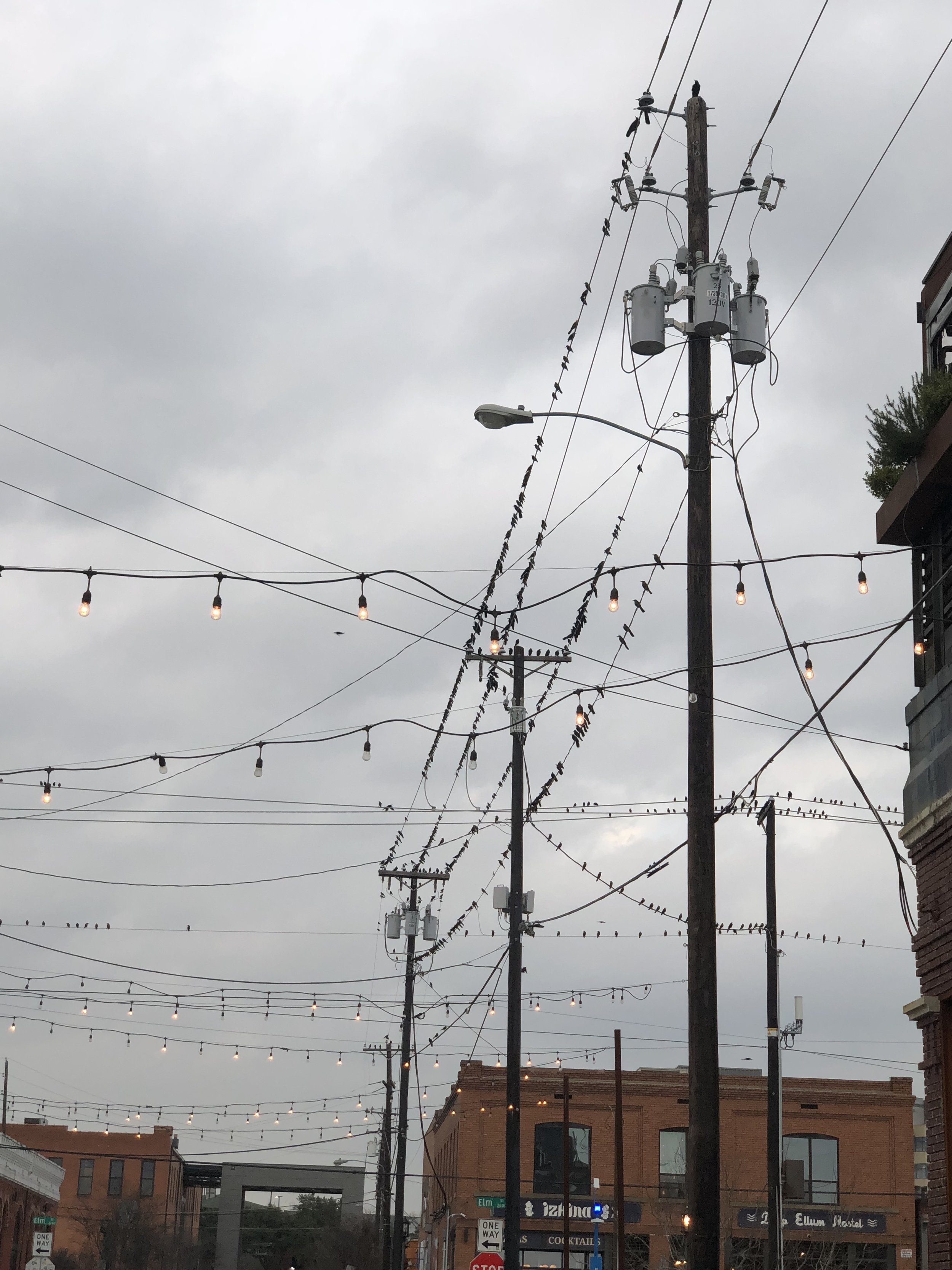
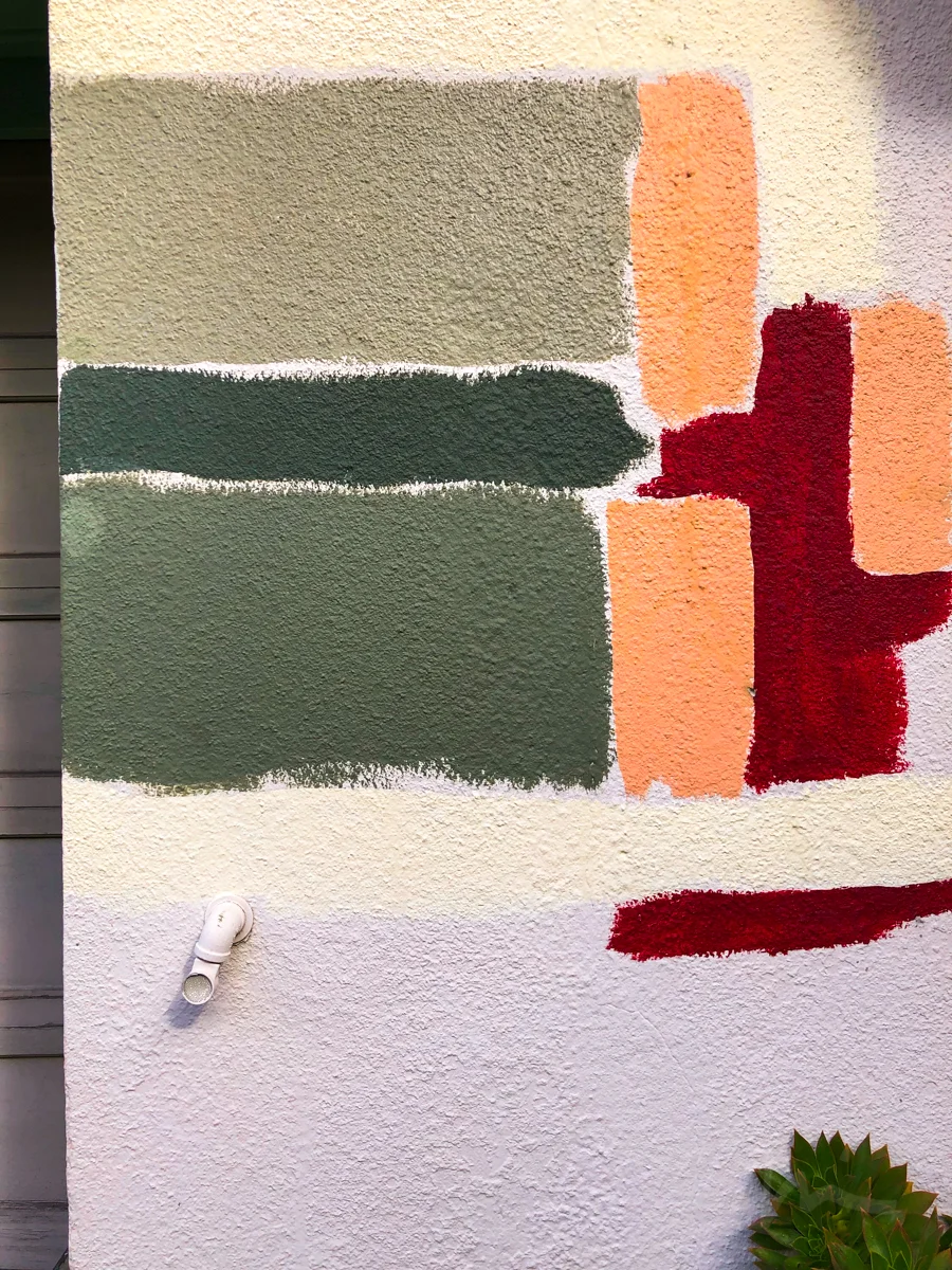
Some of Suzanne’s snapshots on her trip. The first row is how she sent them to me, the second row was my messing around with a little post production.
The first one is like a face. Since the color didn’t really add too much, i wondered whether making it monochromatic wold diminish distractions and enhance the face-ness. Not sure.
The powerlines felt unfocused to me, and the thing that was compelling was the weird array of lines in all directions, the birds on some and the lights on others… so i cropped tighter to accentuate this detail, cut out distractions, brought up the saturation and blacks a little to make the lights pop more.
The weird color swatches on the wall just needed a little color balancing, a tiny bit of brightening. It’s oddly surreal.
Suzanne’s selfie during our podcast recording is wonderfully composed, the frame feels full of interest and dynamic energy — the only issue was the white balance, and this shot is very hard: the room is lit mostly from daylight out a window, with a little bit of in-room fixtures, and then the computer is completely different color temperature — blue. So one white-balance fix won’t really solve it. I tried b&w but it lost the immediacy, so i just tweaked the white balance for the outside light and took all the saturation down a little so it was less problematic. It’s not done, but it would take more work to adjust the colors differently across the frame.
Rubin’s Portfolio of Photography | Rubin’s Instagram (@droidmaker)
Suzanne’s Instagram (@sfritzhanson)
If you like our show, please subscribe on iTunes, Google Play, or your favorite podcasting app, and please rate the podcast. And don’t forget to join the Neomodern Facebook group to discuss the show, share your photos, hear about specials for printing or framing your best images. Thank you!


